Put down your pitchforks, hardcore WordPress users – we know that comparing Gutenberg vs Elementor isn’t the fairest of fights. These two editors are at different stages in their development and have different focuses.
But here’s the thing:
Not everyone is a power user who’s been closely following the development of the new WordPress block editor (dubbed “Gutenberg”). Some people just want a page builder because it lets them add some extra styling to their posts and pages.
And once WordPress 5.0 ships, a lot of normal WordPress users are going to be wondering how Gutenberg and Elementor stack up and which tool is right for them (if you’re reading this post, you might well be one of those folks!).
Well, we have the WordPress 5.0 Release Candidate as well as the latest version of Elementor on our test site. So…let’s find out.
What We’re Comparing (No Elementor Pro)
To make this a fairer fight, we’re going to compare the free version of Elementor vs Gutenberg. That means we’re not going to even mention a lot of the Elementor Pro features like theme building, Zapier integrations, etc.
Those features are super powerful, but if you need them you’re probably already using Elementor.
Basically, we’re just trying to compare the differences in how a normal person might experience creating a more styled post or page with both Gutenberg and Elementor.
A Tale Of Two Pages – Our Examples
Here are the two basic landing pages that I’ve built with both Elementor and Gutenberg.
Both of these are using the free version of our StartRight theme, which includes a full-width page template.
Here’s what my basic Elementor landing page looks like:

And here’s what it looks like when I tried to approximate that same basic design using Gutenberg:

Now, let’s go behind-the-scenes and I’ll show you what went into those two end products.
Building The Elementor Page (This Went A Lot Faster)
Without rehashing our full Elementor page builder review, I’ll just say that Elementor gives you a lot of control over your content’s design.
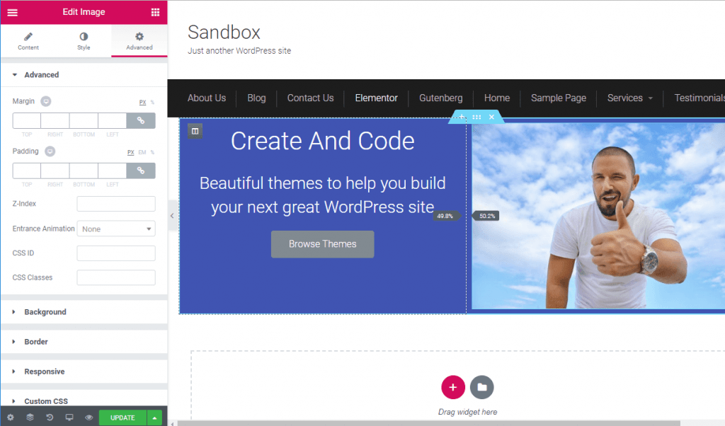
Controlling the columns is easy – you just drag and drop the divider. You have full control over spacing, with the ability to add your own margins and padding, etc. Changing backgrounds and styling is similarly simple with the detailed controls…
Yeah, that’s not the half of it, but you can do a lot more than Gutenberg. Building the hero section was as simple as adding a two-column section and throwing in some basic widgets:

Setting up the features section with Elementor also only took a few seconds. I just created a three-column section and then used the Image Box widget to add the format below with a single widget:

Finally, the two testimonials are also easy thanks to Elementor’s Testimonial widget. You just drag it in, add your information, and you’re set to jet:

Building The Gutenberg Page (Compromise Is Key)
With Gutenberg, you’re not going to have nearly the same level of control. Whereas Elementor is “I’m going to tweak this until it’s pixel-perfect”, Gutenberg is “ehh, that’s close enough to what I want”.
The first thing that you’ll notice with Gutenberg is, of course, that it’s not a visual editor. That is, you don’t get to see the front-end of your site while your building your page.
While the body of Gutenberg does try to give you a visual preview (and developers can bring front-end theme styles into the editor), you’ll still have to make liberal use of the Preview button if you want to see how your design fits in your theme. For example, you’ll see in the screenshots below that the in-editor design looks nothing like the end product I showed you above.
To create the Hero section, I used the Media & Text block to add the various content. It’s pretty convenient for being able to create this type of hero layout, and it’s also the only way to create a background for an entire section (you can’t do it with the Columns block, which I found after some frustration).
I couldn’t use headings inside the box as you can’t change the text color for headings, so I had to use paragraph text instead:

To create the feature list, I used the Columns block to create three columns. Then, I added a separate image, heading, and paragraph block inside each column:

It’s definitely a little more work than Elementor, but the end result lets you get pretty close to Elementor’s Image Box widget, though I’ll point out some alignment issues later on.
To create the spacing between the feature images and the header, I also had to add a Spacer block between the hero section and the image boxes.
The Spacer block is really helpful for separating blocks vertically, but it’s still a far cry from the box model padding/margin controls that you get with Elementor.
Creating the same testimonial effect with Gutenberg is not as simple.
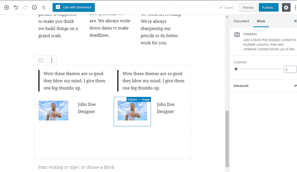
After playing around with a few solutions, I opted to nest two columns blocks inside another columns block (yes – it was a little awkward) and use the quote block for the testimonial:

Summing It Up: Gutenberg vs Elementor
Ok, at this point, I got a little frustrated with trying to build more complicated layouts with Gutenberg so I opted to call my landing page complete.
So what conclusions did I draw from this little test?
Where Gutenberg Is A Viable Alternative
Gutenberg is a viable alternative for Elementor if you:
- Don’t want to get too crazy with content. For example, you’re mainly looking for buttons, tables, stuff like that.
- Are using a mostly single column layout. Yes, Gutenberg does have columns…but they’re not great right now, so it would be frustrating to rely on them a lot.
- Don’t care about being able to perfectly align every piece of content. If you aren’t familiar with padding and margins, you might be fine with using the basic Gutenberg alignment options along with the Spacer block.
- Don’t care about detailed styling, either. For example, if having to try a few different blocks until you find one that lets you change the background color doesn’t annoy you, you’ll be in business.
I know that sounds a little critical, but I actually think Gutenberg can work in a lot of situations.
For example, if you’re an affiliate marketer just trying to add a little spice to a product comparison post, Gutenberg might be all that you need.
Gutenberg has a lot of quirks, though. And you’ll need to be ok with settling for “good enough” rather than getting things perfect.
For example, if you look at the Gutenberg version of the landing page again, you’ll see that the three feature images don’t have a perfect alignment (there’s that weird space on the right side). I couldn’t figure out how to fix that with Gutenberg, whereas Elementor had no such issue:

Elementor Is Better For…
Well, literally everything that isn’t one of those scenarios above.
If you want to:
- Have full control over styles, spacing, etc.
- Use pre-built widgets instead of workarounds (e.g. just drop in an icon box)
- Create designs that differ from your theme’s default styling.
- Work with flexible column layouts.
- …you get the idea.
Is There Any Performance Difference Between Elementor vs Gutenberg?
Ok, so I think it’s pretty obvious that from a design flexibility perspective, Elementor is the clear winner (yeah, not exactly a mind-blowing conclusion).
But – is there any performance difference between the Gutenberg block editor vs Elementor?
To find out, I ran some tests on my two demo pages to figure out:
- File size
- Number of requests
According to Pingdom…
The Gutenberg page:
- Is 1.0 MB
- Had 47 requests
The Elementor page:
- Is 1.3 MB
- Had 54 requests
This isn’t the most scientific of tests, so don’t draw too many conclusions. But it does seem like Gutenberg might be a little more lightweight, which might be another reason to opt for Gutenberg if you don’t really need all the flexibility that Elementor offers.
Final Thoughts On Elementor vs Gutenberg
Ok, so beyond the fact that I’m a horrible designer who should never be let near a landing page, what did we learn from this little Gutenberg vs Elementor comparison?
First off, Gutenberg is nowhere near a 1:1 Elementor alternative. If you go into things thinking that Gutenberg will let you do all the same types of things as Elementor, you’re going to be disappointed.
However, that doesn’t mean Gutenberg is worthless, because not everyone needs a 1:1 replacement for Elementor, and Gutenberg is certainly a lot closer to Elementor than the original TinyMCE editor was.
Gutenberg is 100% a viable option if you just want a lightweight way to add new types of content or some basic layouts to your WordPress content.
No, it doesn’t give you that same pinpoint level of control that Elementor does, but you can get Gutenberg to do a lot of new things that weren’t possible with the TinyMCE editor, and that just might be enough for day-to-day usage.
Oh – and one more thing. This doesn’t have to be an either/or decision. Elementor recently released their official Elementor Blocks for Gutenberg plugin which lets you easily insert any of your Elementor templates as a block in Gutenberg.
That means you can use Gutenberg for the basic stuff and create a reusable Elementor template block for anything else.
Now over to you all – how do you think Gutenberg vs Elementor shakes out? Will you try to use Gutenberg for some of the things you previously relied on Elementor for?